
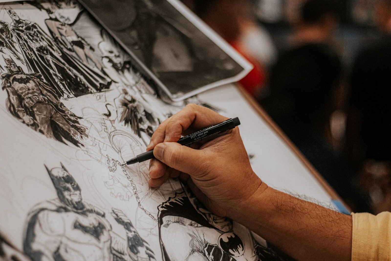
Great comic art does more than look pretty. It tells a story your eyes can follow without effort. When you review a comic, comic artwork quality shapes how readers feel every page. A strong artist guides your eye, builds tension, and makes quiet moments hit hard.
Many reviewers focus only on plot or dialogue. That misses half the medium. Comics are a visual art form first. The pictures carry weight the words alone cannot. Learning to judge comic artwork quality with a sharp eye makes your reviews sharper and more useful to readers.
This guide breaks down the core elements you should study: panel layout, color choices, line work, and consistency across issues. Think of it as training your eye the same way a fighting game fan trains their reflexes. You start slow, notice patterns, and soon you spot details others miss.
What "Comic Artwork Quality" Really Means
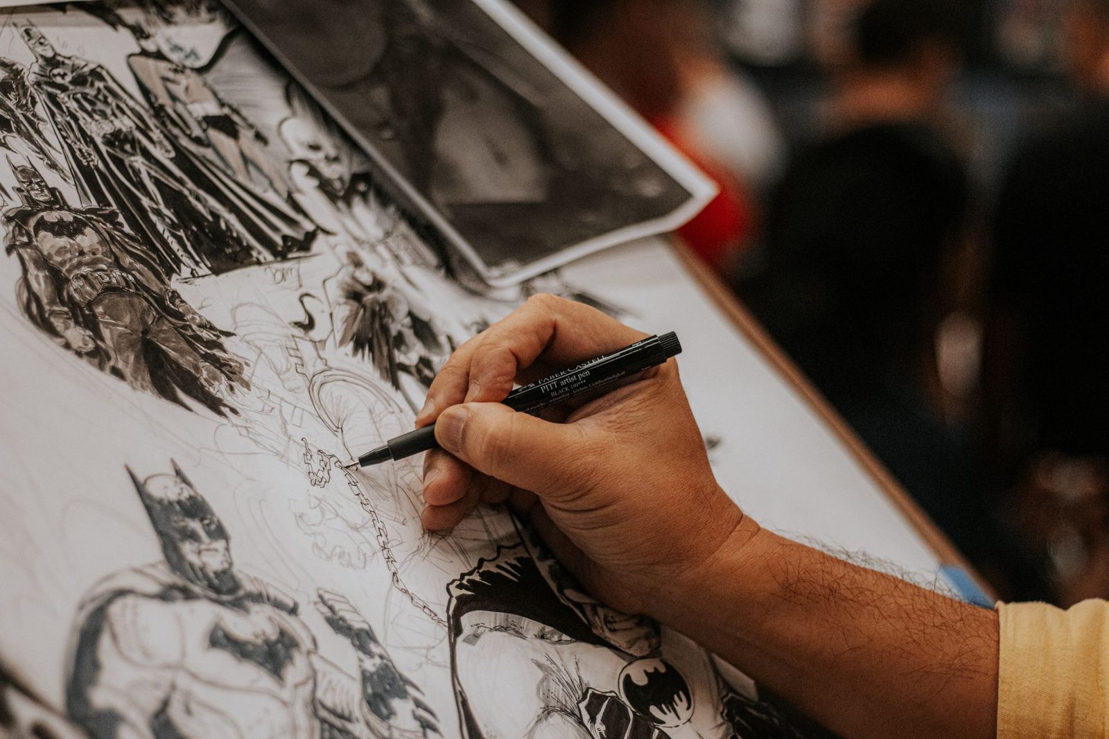
Comic artwork quality is not just about pretty drawings. It is about how well the art serves the story. A messy, rough sketch can still show high quality if it fits the tone. A polished, glossy image can feel wrong if it clashes with the mood.
Think of art quality as a mix of three things. First, technical skill: can the artist draw anatomy, perspective, and motion well? Second, storytelling choices: does the art help you understand what is happening? Third, emotional impact: does the page make you feel something?
A reviewer who only checks the first box misses the bigger picture. Some of the most beloved comic artists use loose, imperfect lines. Their work still ranks high because it serves the story so well. Judging comic artwork quality means balancing craft with purpose.
Panel Composition and Visual Flow

Panel composition is how an artist arranges images on a page. Good composition guides your eyes in the right order. Bad composition leaves you confused about what happened first.
Watch how panels vary in size and shape. A tiny panel can slow down a scene. A huge splash page can signal a big, important moment. Artists who understand pacing use panel size like a director uses camera angles.
Ask yourself these questions when you review a page:
- Does my eye move naturally from panel to panel?
- Do panel breaks match the rhythm of the dialogue or action?
- Does the layout create tension, calm, or confusion on purpose?
Great composition often goes unnoticed because it feels effortless. Bad composition draws attention to itself. If you find yourself rereading a page to figure out the order, that is a sign of weak layout work. This single skill separates decent comic artwork quality from truly excellent work.
Color Work and Mood

Color does heavy lifting in comics. It sets mood before you even read a word. A page bathed in cold blues feels very different from one bursting with warm reds.
Look at how colorists use light and shadow. Strong color work adds depth without overwhelming the line art underneath. Weak color work can flatten a page or clash with the linework's tone.
Pay attention to color consistency too. Does a character's costume stay the same shade across chapters? Small shifts can happen for a reason, like a scene set in different lighting. But random shifts often signal a rushed job or a change in art team.
Many art schools teach color theory as a core skill for visual storytellers. If you want to dig deeper into how color affects perception, resources from academic art programs can help build your foundation, such as those found through the Smithsonian's public collections, which include historic examples of color use in illustration and print art.
Line Work, Detail, and Consistency
Line work is the backbone of most comic art. It defines shape, texture, and energy. Thick, bold lines often show strength or danger. Thin, delicate lines can show fragility or calm.
Check how consistent an artist stays across an entire issue. Fatigue, deadlines, or multiple guest artists can cause quality dips. A single issue with strong art in chapter one but sloppy art by chapter four often points to rushed production.
Also study how backgrounds are handled. Some books use detailed backgrounds throughout. Others use simple backgrounds during dialogue and detailed ones during action. Both choices can work well, as long as they feel intentional rather than lazy.
For historical context on how illustration techniques have evolved, the Library of Congress holds archives that trace the development of print illustration and sequential art over time. Comparing older and newer styles can sharpen your sense of what counts as skilled versus rushed work today.
Practical Steps for Reviewing Comic Artwork Quality
Here is where theory turns into action. When you sit down to review a comic, use a clear process instead of a gut reaction alone.
Practical steps to follow:
- Read through once for story, ignoring art details.
- Read again focusing only on panel flow and pacing.
- Study color choices on three or four key pages.
- Check line consistency from the first page to the last.
- Compare the art style to the tone of the writing.
This method works the same way esports analysts break down a match. You do not judge a player on one flashy move. You watch full rounds, spot patterns, and separate luck from skill. Comic art deserves the same patient breakdown.
Our analysis of strong comic runs shows a pattern. The best books align art and story so closely that readers stop noticing the artist's hand. That invisible skill is often the highest sign of quality. When you can spot it, and explain why it works, your review gains real depth. Readers trust reviewers who can point to specific pages and specific choices, not vague praise like "the art is great."
Conclusion
Comic artwork quality is not a single number you can rate out of ten. It is a blend of composition, color, line work, and consistency working together. The best reviewers train their eye to spot these layers, then explain them clearly for readers.
Next time you review a comic, slow down on the art. Notice the panel flow. Study the color choices. Check for consistency across the issue. Your readers will feel the difference in your reviews, even if they cannot name why.
For more context, read Complete Guide to Building a Sustainable Wellness Routine.
For more context, read makeup coverage.
For more context, read How does peer review actually work before publication?.